When it comes to school funding, how money is raised can be just as important as how much is spent. In “The Source Code: Revenue Composition and the Adequacy, Equity, and Stability of K–12 School Spending,” the Albert Shanker Institute explores not just how much public education systems spend, but where that money comes from—and how the balance of state and local funding affects fairness, adequacy, and fiscal stability. To help make the report’s findings more accessible and actionable, our team partnered with Albert Shanker to design interactive data visualizations that unpack complex funding dynamics and allow users to explore state-by-state differences with clarity and context.
A Visual Extension of a Comprehensive Report
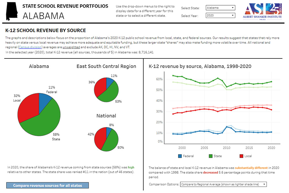
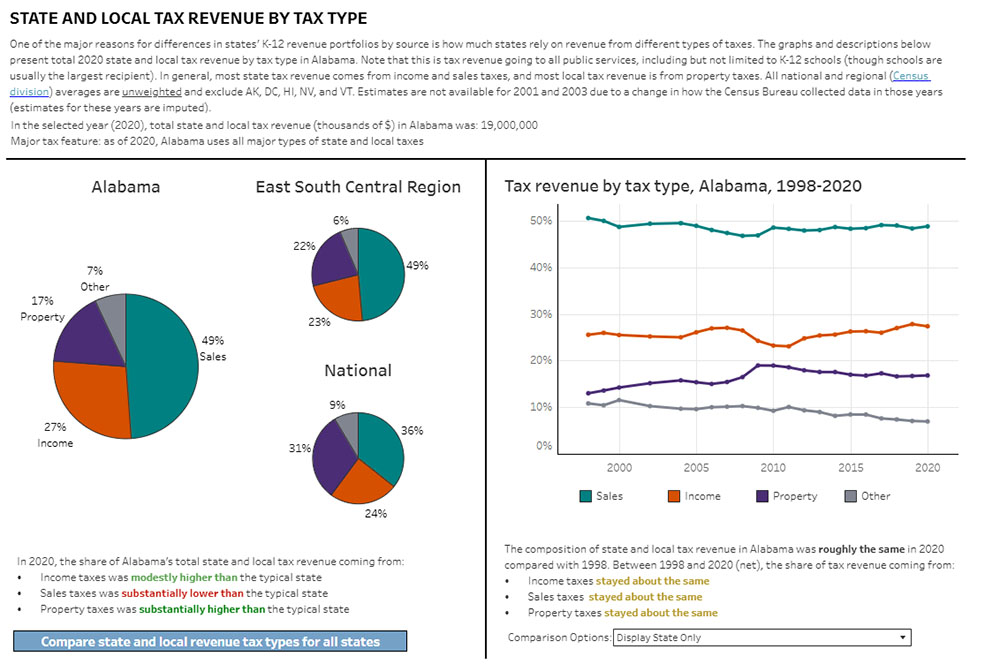
The report highlights that while national averages suggest a near-even split between state and local funding, individual states exhibit significant variation. These differences can lead to disparities in funding adequacy and equity across districts.
The report is extensive, and one of the key challenges was making the report’s core findings digestible and engaging for a broad audience. Our goal was to create visual tools that make the data more accessible for advocates, researchers, and policymakers alike.
Translating Complexity into Clarity
At the heart of this project was the challenge of turning a complex report into something clear and engaging. For example, the report highlights comparisons in school funding sources and state and local tax sources, but also offers regional and national comparisons of a state’s school revenue portfolio. These can easily become entangled if presented to users all at once.
We focused on simplifying this complexity through data storytelling techniques such as:
- Customizable Comparisons: Users can select which kind of comparison they are interested in at a given time. They can compare the proportion of state, local, and federal funding for each state in comparison to regional and national averages using dropdown selectors.
- Visual Consistency: A unified color palette and layout ensures visual continuity across charts, allowing users to track related concepts across visuals.
- Explanatory Text and Tooltips: Every visualization includes plain-language descriptions that change as users interact with the dashboard, to help users understand what they’re looking at.
Empowering Stakeholders Through Data
By transforming complex datasets into user-friendly visual narratives, we aim to empower educators, policymakers, and advocates to make informed decisions. Understanding the implications of revenue composition is vital for crafting policies that promote both equity and stability in school funding.
The interactive tools serve as a bridge between detailed research and actionable insights, facilitating a deeper engagement with the report’s findings.
Looking Ahead
As decisions around education funding continue to evolve, states will need to continue to reevaluate their school funding portfolios. Tools that help policymakers and advocates understand and compare school spending revenue portfolios will be critical in this endeavor. We are proud to have worked with Albert Shanker Institute to provide visualizations that engage and inform educational policy leaders.
For a comprehensive exploration of the data and to interact with the visual tools, visit the Albert Shanker Institute’s report page: The Source Code: Revenue Composition and the Adequacy, Equity, and Stability of K-12 School Spending. And if your organization is working to surface critical insights from complex data, we’d love to talk about how visual analytics can help drive your mission forward.