Our Insights

Category: Analytics

data analytics consulting
Analytics

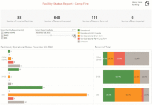
California Department of Public Health Launches a Wildfire Emergency Dashboard

In November 2018, the deadly Camp Fire and Woolsey Hill Fires impacted both Northern and Southern California simultaneously. To better understand how the fires affected health facilities across the state, Analytica partnered with the California Health and Human Services Agency and various government departments (CDPH, OSHPD, DHCS, DSS) to build an interactive version of the daily status report to be disseminated to stakeholders across the state each day during the incidents. The resulting dashboards reported both operational and evacuation status of facilities near the fire perimeter using key performance dashboards and interactive maps. Future incidents will use this template for reporting, allowing end users to gain daily updates and drill-down information regarding impacted facilities during an emergency. Additionally, users will see a historical record with the ability to perform deeper analysis on how emergencies affect impacted communities.

Read More »
Analytics

Helping Illumina Become More Data Driven

CIO of illumina, Norm Fjeldheim has said, “Analytica’s team has done a great job setting up and supporting our Tableau environment and developer community here at illumina.” Find out what we did to gain his approval.

Read More »
Analytical Studies

CEO Tenure & Retention Dashboard

Analytica Consulting partnered with the Community College League of California to produce the 8th Update of the CEO Tenure & Retention Study.  This update is the first version to feature a dynamic dashboard with visual representations of over 100 years of California Community College chief executive officer tenure data. The dashboard is an interactive infographic that displays the growing presence of women in CEO positions, the effects of the Great Recession on CEO retention, and provides a snapshot of the diversity of California CEOs. Through dynamic charts and tables, users can identify trends and outliers to gain additional insight into the data. View Interactive Dashboard

Read More »
Analytics

California Department of Public Health Launches Public-Facing Dashboards

Congratulations to the California Department of Public Health for releasing publicly-available interactive data visualizations!  As one of the first State Agencies to provide public data via interactive dashboards, they are setting the pace for transforming static reports into dynamic, user-friendly tools. By utilizing these tools, CDPH is providing the public with a way to connect with publicly available data like never before, while encouraging them to ask questions, explore data, and make their own unique data discoveries. To view the dashboards, click here. For more information on how your organization can utilize data visualizations to connect users with data, please email us at [email protected].

Read More »
Analytics

Helping Illumina Become More Data Driven

CIO of illumina, Norm Fjeldheim has said, “Analytica’s team has done a great job setting up and supporting our Tableau environment and developer community here at illumina.” Find out what we did to gain his approval.

Read More »
Analytics

California Department of Public Health Launches Public-Facing Dashboards

Congratulations to the California Department of Public Health for releasing publicly-available interactive data visualizations!  As one of the first State Agencies to provide public data via interactive dashboards, they are setting the pace for transforming static reports into dynamic, user-friendly tools. By utilizing these tools, CDPH is providing the public with a way to connect with publicly available data like never before, while encouraging them to ask questions, explore data, and make their own unique data discoveries. To view the dashboards, click here. For more information on how your organization can utilize data visualizations to connect users with data, please email us at [email protected].

Read More »
Visualization

Los Angeles Real Estate Visualization

Brent Johnson, Senior Consultant at Analytica Consulting created the dashboard below for visualizing the real estate market in Los Angeles. The dashboard breaks the market down by property type and the decade of construction. It also shows a detailed map of Los Angeles properties with a street view of each selected home. The tool is highly useful for anyone looking for a specific number of bedrooms or bathrooms, a desired zip code and cost. If you have any questions or would like more information regarding this visualization tool, contact Brent at: [email protected].

Read More »